 |
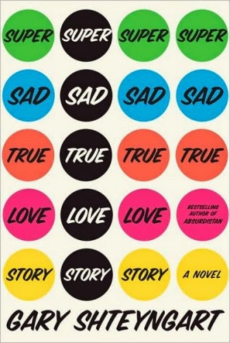
| I like this cover because it reminded of those colorful circle stickers you would get in school and to me I liek to explore things if they make me feel familiar and comfortable. |
Tuesday, March 17, 2015
5 Book Covers and Questions
Thursday, March 12, 2015
My Favorite Book
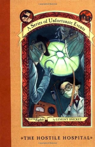
I think the book cover was good at capturing the storyline of this book because this book is a part of a series. This series of book is basically about three siblings that are orphans and they are trying to get away fo Count Olaf and they find out a lot of family secrets along the way. With that being said it was successful because each cover shows you what scenery they would be in in that book and this one is a hospital. It intrigues someone who is reading the series because you want to know what is going to happen in the hospital and what is going to happen. Also there is a title but the font is small because the title is not as significant as the picture, I feel this cover was very well designed and definitely intrigues especially young kids to read it.
Wednesday, March 11, 2015
Logo Reflection
What was the most challenging aspect of creating your logo design?
The most challenging aspect of creating my logo design was figuring out what type of font i would use. This was hard for me because I knew I needed a simple font that would be easy to read. Eventually I created my own font with a tool on Illustrator which helped me overcome this issue! I think that was the best decision for my project and it actually successfully worked out.
What was the most successful aspect of your logo design?
The most successful aspect of my logo design was creating the basketball needed in my design through illustrator. To me this was most successful because at the start of the project I was just going to copy and paste a basketball fro the internet but in the end I created my own basketball shape. This was a big accomplishment for me and therefor the most successful because it definitely made my logo design better and enhanced for the better.
Tuesday, March 10, 2015
Mid Winter Recess
Over mid-Winter Recess i went to tour a college that I am 95% is the college for me. This school is known as SUNY Potsdam. it is located in upstate New York. I left on February 14th in the night and came back on February 18th. I stood with a friend that attends school there and I had an amazing time. The food was great, her friends were really nice, and just in general the school was really beautiful. Below is a picture of me on the bus up there and how many degrees it was, the dorm, the ice skating rink over there and a picture I took of the Potsdam bridge.
When I came back I went to the restaurant Big Daddy's for the first time ever with my best friend Chynna and it was amazing! That was basically what I did over my mid-winter break.
Look at Art- MoMa
The artwork that I looked at was I and the Village by Marc Chagall. I could not get a picture of it so I will describe it for you. On the right side of the picture is a man whose skin is green and on the left side of the page is a colorful unicorn. The man is holding a tree like object and in the middle of the picture is a road with a man on it that looks to me like a road leading into a city or village.
This picture/artwork caught my eye because of the colors. I was intrigued to see a man colored green because people are not usually that colored skin. I also thought that it was cool that the unicorn and him are looking into each other's eye.
This artwork is located in the MoMa. This artwork was in the kids section and the reason why I yielded to this section is because artwork made for children is easy to understand and I like things that are easy to understand and have bright colors.
This piece drew my attention specifically of the colors. It is a really colorful piece and I become so intrigued with color schemes. The picture drew me in and by being drawn in by colors I saw the rest of the images captured with this one piece of artwork which was really beautiful and amazing to see.
I know that the piece is that the artist was trying to incorporate his home in Russia with the folktales he would hear as a kid and he wanted to incorporate them into one piece. he wanted to mix his reality with the unreal which i think it is so cool!
Subscribe to:
Comments (Atom)


