Wednesday, April 29, 2015
Micro- Aggression
I have one micro-aggression experience. When I meet other spanish people like myself and I say I am spanish they usually start talking in spanish because they assume I speak it. I usually give them a weird look and then they say "you're spanish but dont speak spanish?!?!. This is offensive because they dont understand my background and it comes off as really offensive.
Tuesday, March 17, 2015
5 Book Covers and Questions
 |
| I liked this book cover because I feel like when I think of something being sucked up I think of a black hole. and this spiral so the brain being sucked as the title and the background being a spiral really enhanced the book. |
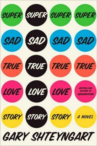 |
| I like this cover because it reminded of those colorful circle stickers you would get in school and to me I liek to explore things if they make me feel familiar and comfortable. |
 |
| I enjoyed this cover specifically because of the background cover and the pedals. It drew me in because i think the simple light blue in the background enhanced the title of the book and the focal point of the pedals. |
 |
| This cover intrigued me and I liked this cover because when you think of smothered hugs you think of a bear hug. They put the bear in the background purposefully to make you think of this and that makes you think of like your dad or mom giving you a tight hug. I enjoyed this cover specifically of the picture they picked to be on the cover. |
 |
| This book cover intrigued me because i like the concept of the book cover. The book is called wide awake and to me when i think of being awake I think of staying up and wasting time on less important thing. Thinking of time right off the back helps relate to the cover because around the book cover is a clock and I like that me and the creator of the book cover think a like. Personally I think using the clock in the background was creative and would make me want to read the book. |
Thursday, March 12, 2015
My Favorite Book
Wednesday, March 11, 2015


Logo Reflection
What was the most challenging aspect of creating your logo design?
The most challenging aspect of creating my logo design was figuring out what type of font i would use. This was hard for me because I knew I needed a simple font that would be easy to read. Eventually I created my own font with a tool on Illustrator which helped me overcome this issue! I think that was the best decision for my project and it actually successfully worked out.
What was the most successful aspect of your logo design?
The most successful aspect of my logo design was creating the basketball needed in my design through illustrator. To me this was most successful because at the start of the project I was just going to copy and paste a basketball fro the internet but in the end I created my own basketball shape. This was a big accomplishment for me and therefor the most successful because it definitely made my logo design better and enhanced for the better.
Tuesday, March 10, 2015
Mid Winter Recess
Over mid-Winter Recess i went to tour a college that I am 95% is the college for me. This school is known as SUNY Potsdam. it is located in upstate New York. I left on February 14th in the night and came back on February 18th. I stood with a friend that attends school there and I had an amazing time. The food was great, her friends were really nice, and just in general the school was really beautiful. Below is a picture of me on the bus up there and how many degrees it was, the dorm, the ice skating rink over there and a picture I took of the Potsdam bridge.


When I came back I went to the restaurant Big Daddy's for the first time ever with my best friend Chynna and it was amazing! That was basically what I did over my mid-winter break.
Look at Art- MoMa
The artwork that I looked at was I and the Village by Marc Chagall. I could not get a picture of it so I will describe it for you. On the right side of the picture is a man whose skin is green and on the left side of the page is a colorful unicorn. The man is holding a tree like object and in the middle of the picture is a road with a man on it that looks to me like a road leading into a city or village.
This picture/artwork caught my eye because of the colors. I was intrigued to see a man colored green because people are not usually that colored skin. I also thought that it was cool that the unicorn and him are looking into each other's eye.
This artwork is located in the MoMa. This artwork was in the kids section and the reason why I yielded to this section is because artwork made for children is easy to understand and I like things that are easy to understand and have bright colors.
This piece drew my attention specifically of the colors. It is a really colorful piece and I become so intrigued with color schemes. The picture drew me in and by being drawn in by colors I saw the rest of the images captured with this one piece of artwork which was really beautiful and amazing to see.
I know that the piece is that the artist was trying to incorporate his home in Russia with the folktales he would hear as a kid and he wanted to incorporate them into one piece. he wanted to mix his reality with the unreal which i think it is so cool!
Thursday, February 26, 2015


Thursday, January 15, 2015
Research: Questions and Summary Blog
Summary:
The club I am planning to do my logo project on is Lady Phoenix Basketball Team. This club is run by a gym teacher from Brooklyn Millennium known as Bryan McCarthy aka Coach mcCarthy. This club is only for girls and its purpose is to give girls that love basketball a chance to compete with other schools in our division and to get better everyday at the sport. the main focus of this club is to build basketball, communication, and teamwork skills. This club is joint together with Brooklyn Millennium so it is open to girls fro both schools. The main color schemes for this club is white, red, and black which is of course school colors. The main theme is centered around Lady Phoenix and to also demonstrate that girls can compete too. The three fonts that i think would be good for this logo is fonts that are easily seen such as Times New Roman, Princetown Let, and lastly Myriad.
Questions:
What is the club about?
The club is working with athletes that love basketball to improve their skills.
What are the goals?
The goals of this club is to improve basketball,communication,and teamwork skills. To have an undefeated record. To win the division B championship.
How long has the club/activity been around?
Coach McCarthy has been the coach for the last four years. Before that Mr. Silverman was the coach for a couple of years but the club has been around since Millennium has become a high school.
What activities do you do?
We have a practice 3-5 times a week and games twice a week. On practice day we work out by doing cardio exercises. We also go over drills and plays for games.
What represents your club?
The school mascot, the Phoenix
The school colors which are white,red, and black.
The fact that we are girls.
What is the theme of the club?
The Lady Phoenix Basketball Team
What is the best part?
Becoming close with other girls from your school.
Learning how to play together.
Winning games and most importantly going far in the post season.
Building unbreakable bonds.
What would you like your logo to represent?
The Lady Phoenix
School colors
What kind of people are in the club?
It is open to any girl from both Millennium's that have some experience playing basketball.
Subscribe to:
Comments (Atom)